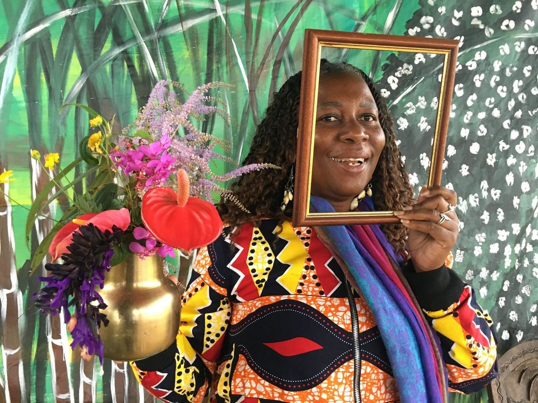
A complete brand identity built from zero for an itinerant women's market rooted in the African diaspora of the Indian Ocean islands.
"If I can do it, so can you."
✦ Scope of Work
Fanm Ansanm — which means "women together" in Créole — is an association co-founded by Klara and Sylvette Annibal, operating under ADB (Afrodiaspora Bridge ONG). The market brings together women entrepreneurs, artists and creatives of the African diaspora across the Indian Ocean islands.
The brief was simple and ambitious: build everything from zero. Logo, brand identity, website, print assets and market collateral — all before the first edition, held in Réunion Island in July 2026.
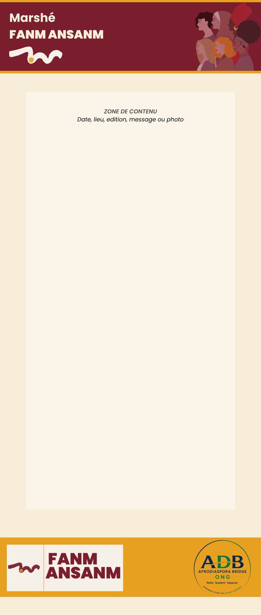
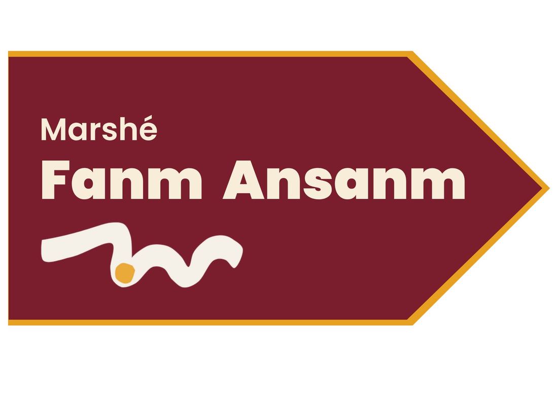
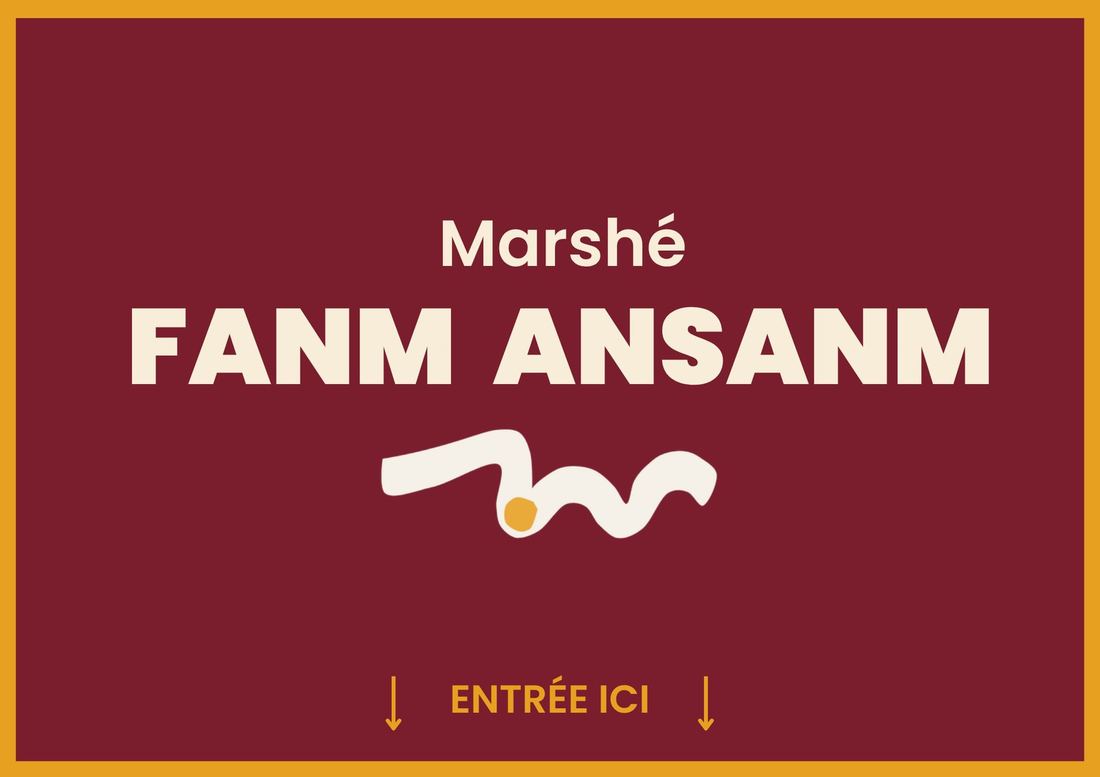
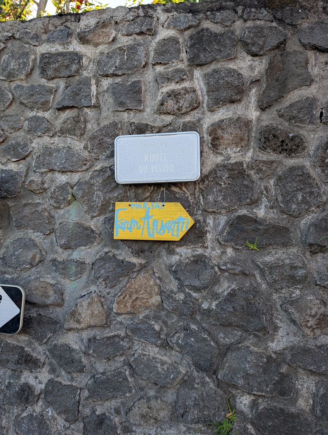
Brand identity · Logo design · Website · Badge & lanyard · Flyer templates · Programme · Exposante directory · Street signage · Roll-up banner · Price display
Brand identity
The visual identity is rooted in the energy of the market itself: Power, Sisterhood, Pride. The palette — deep burgundy, saffron, soft cream — draws from the colours of the Indian Ocean diaspora. The typography, Poppins, was chosen for its rounded curves that evoke warmth and community rather than the sharp edges of a corporate brand.
← Scroll to see all materials →
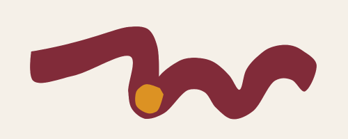
The logo features a hand-drawn NM wave — the last two letters of both FANM and ANSANM — representing the Indian Ocean that connects all the islands the market travels to. A saffron dot sits in the valley between the N and the M, separating the two letters without breaking the flow. A meaning hidden in plain sight.
The work
The mission: unite women of the African diaspora — entrepreneurs, artists and creatives — living across the islands of the Indian Ocean. Showcase their work, amplify their voices, and create a space where money, knowledge and power circulate within the community.
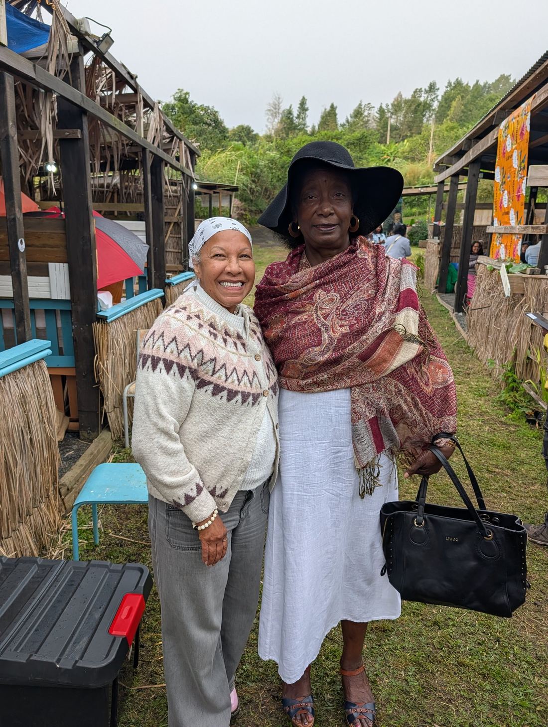
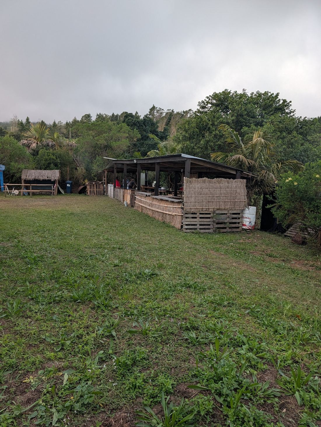
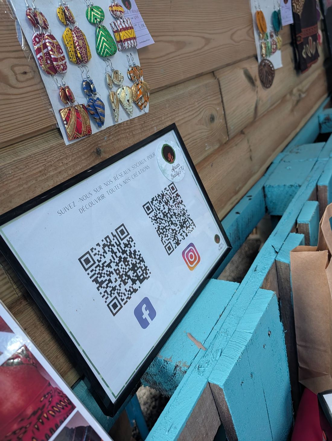
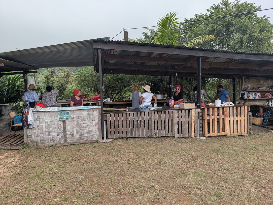
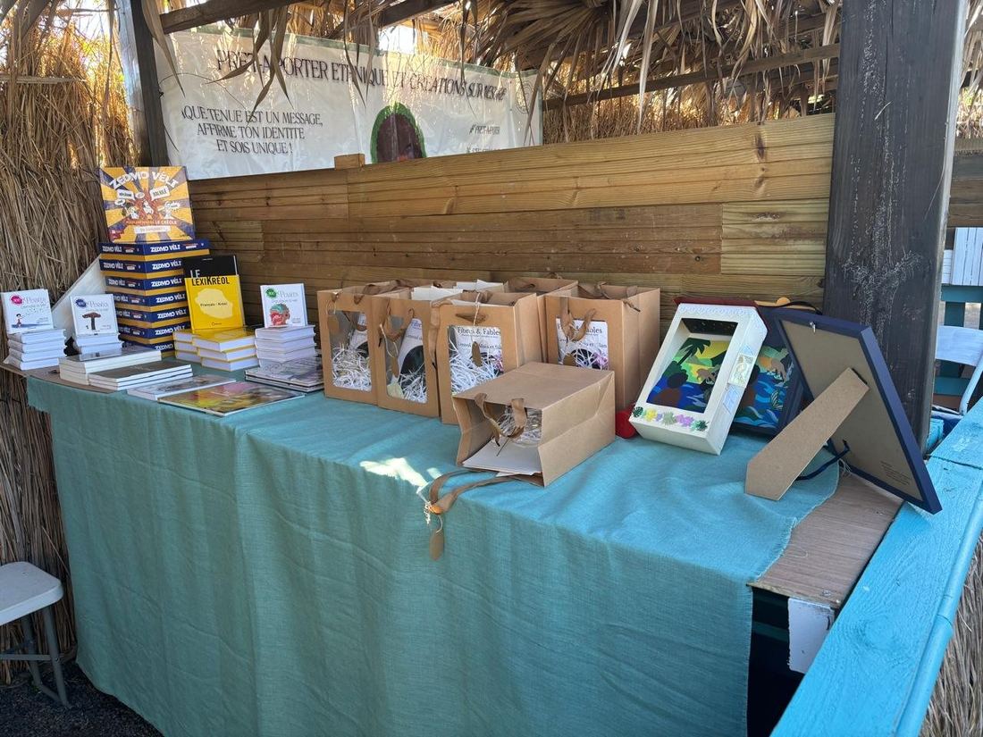
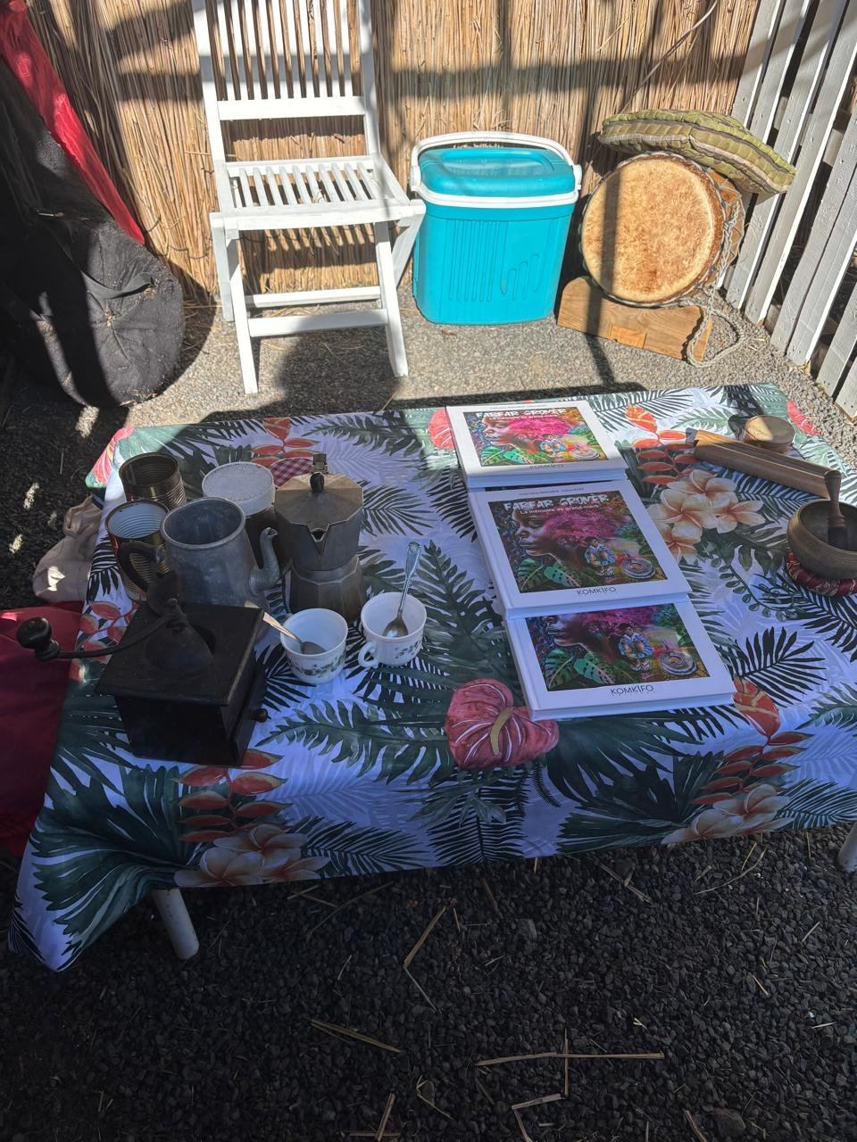
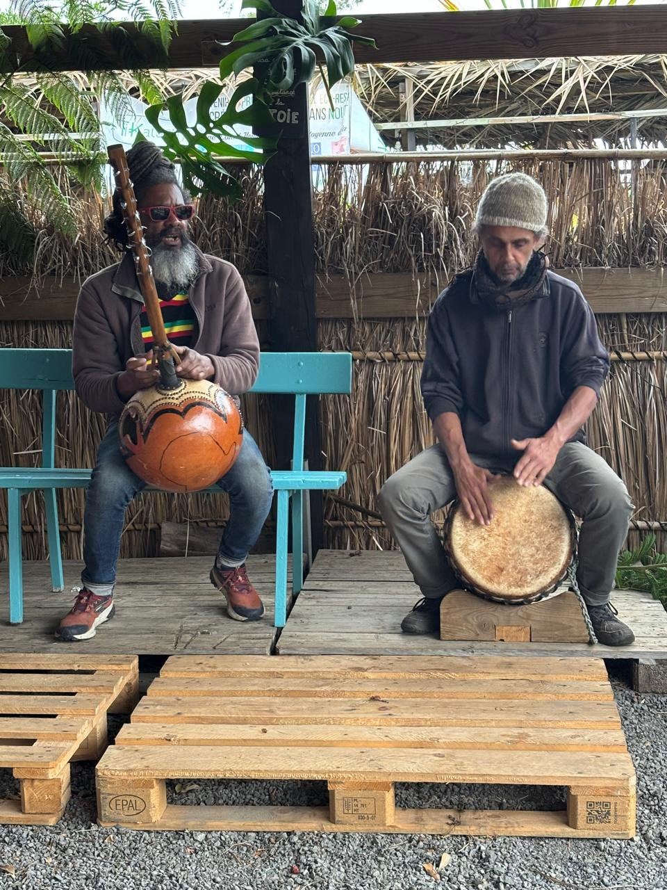
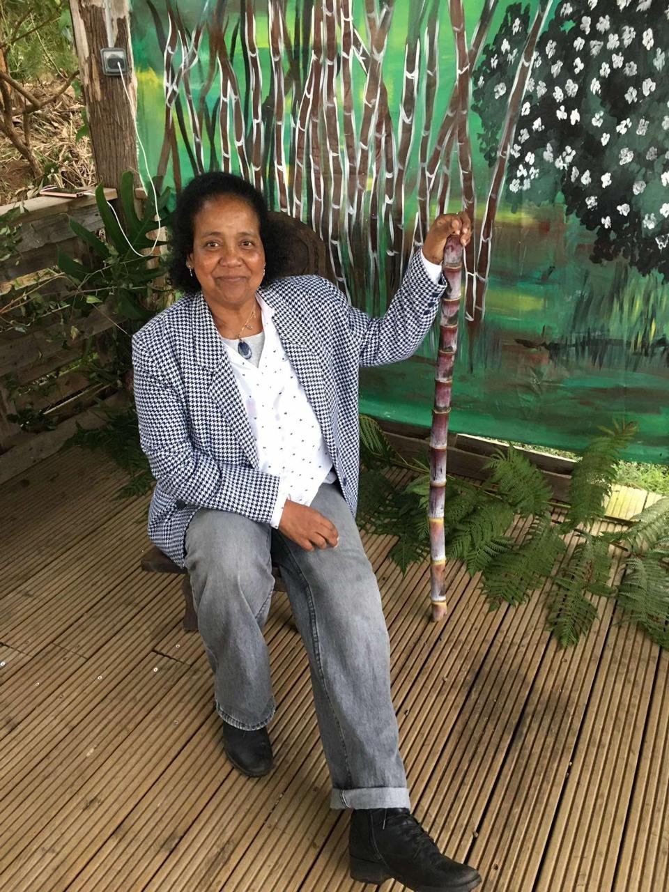
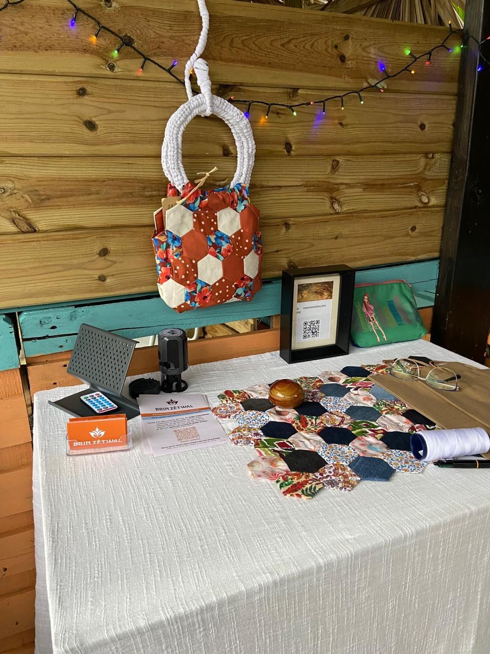
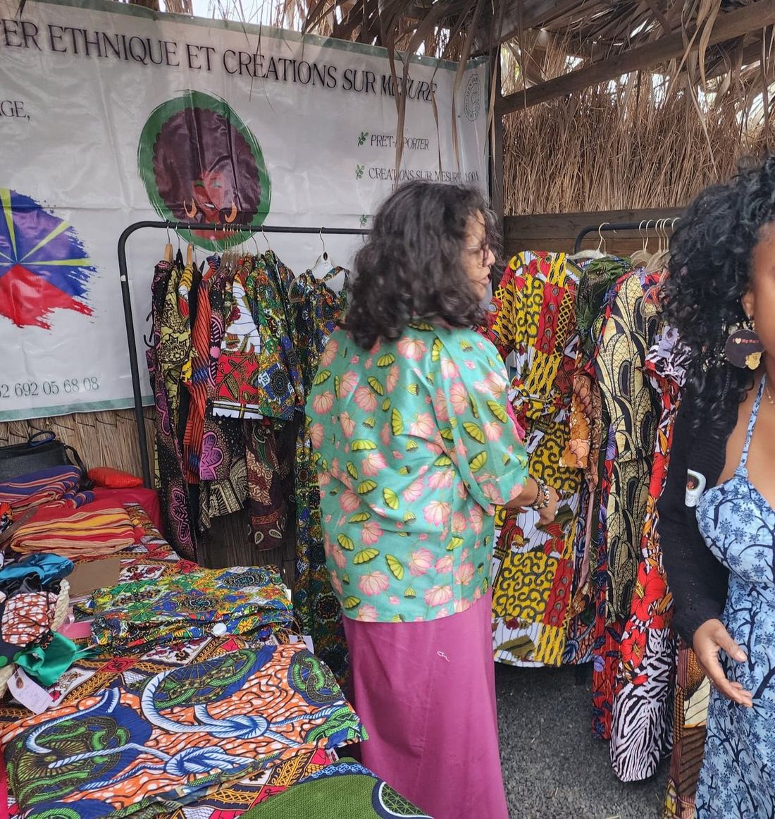
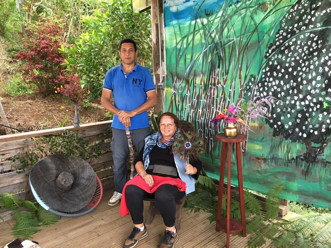
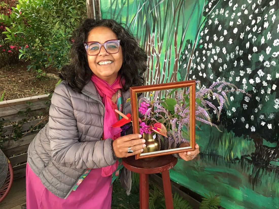
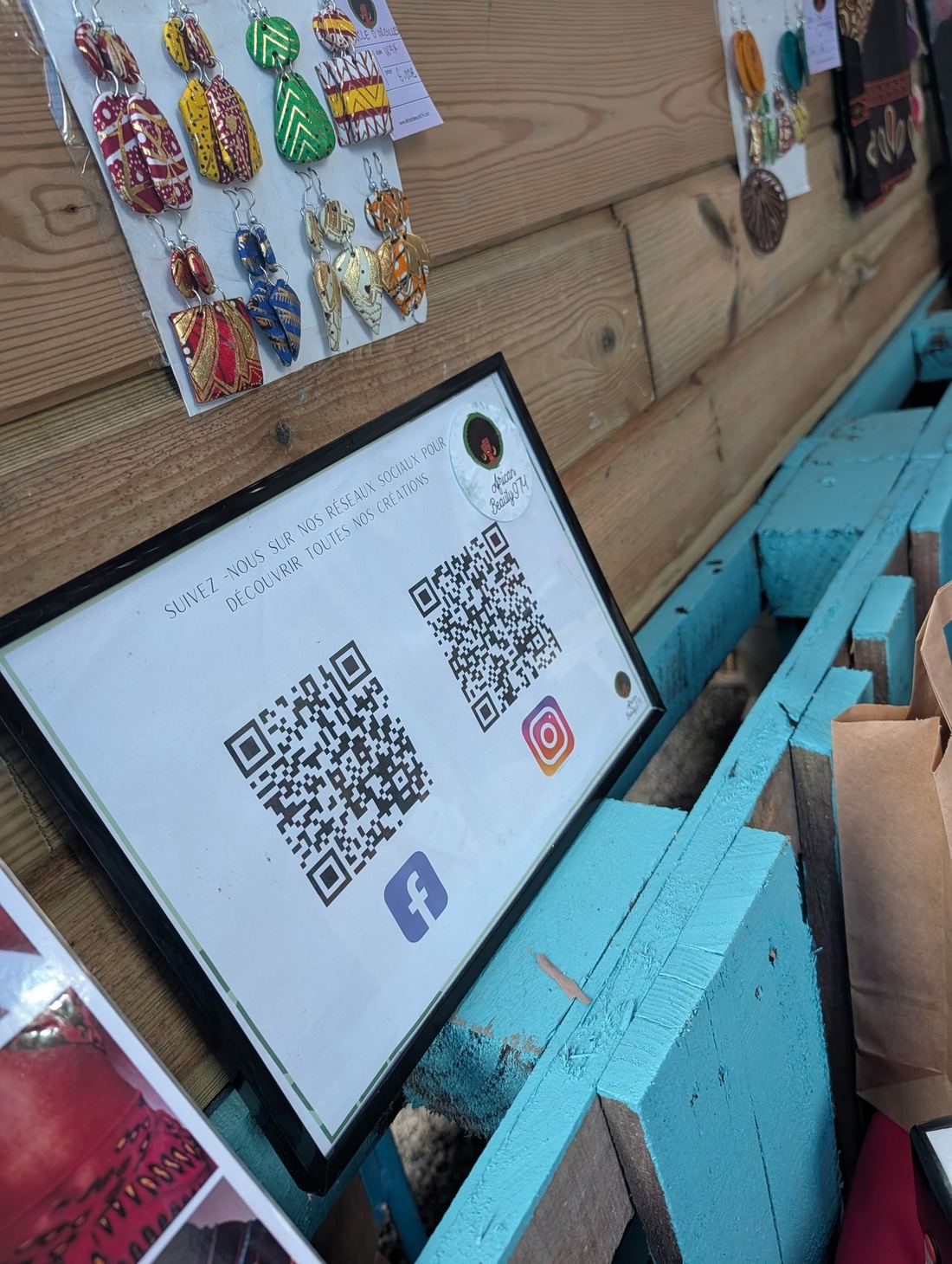
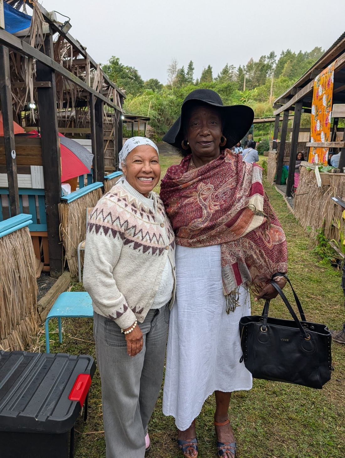
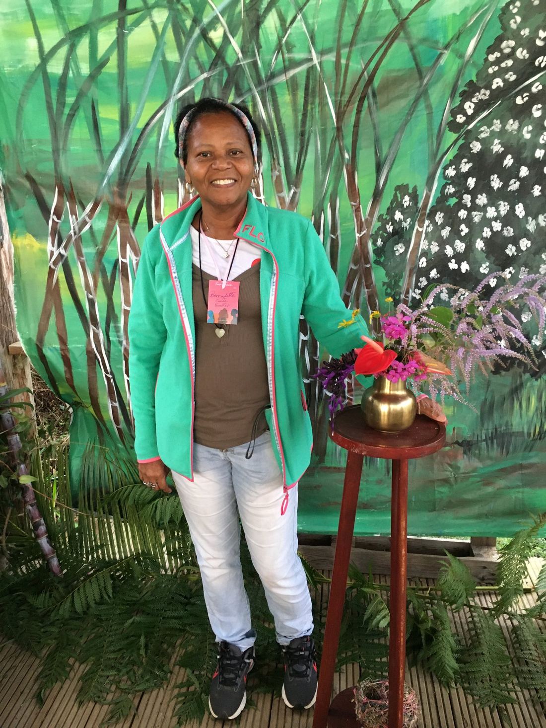
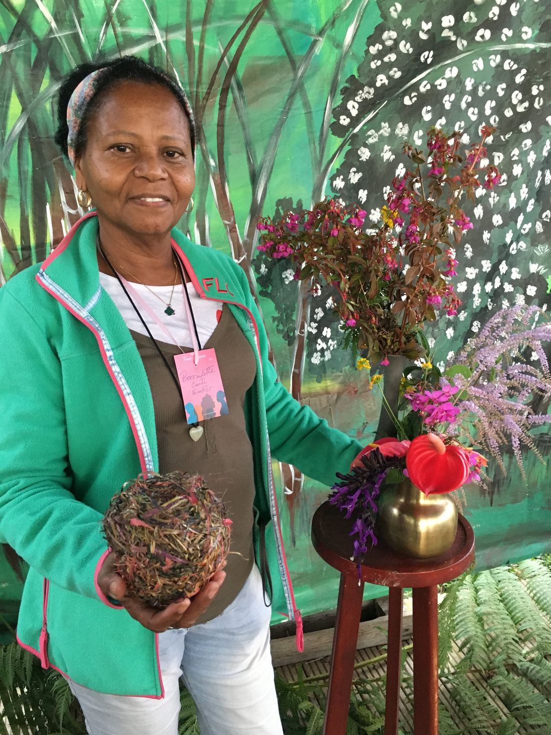
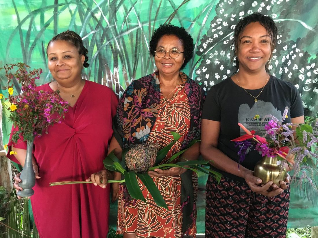
The first edition of the Marché Fanm Ansanm was held in Réunion in July 2026, bringing together 12 exposantes — with additional members who took part without selling on market days.
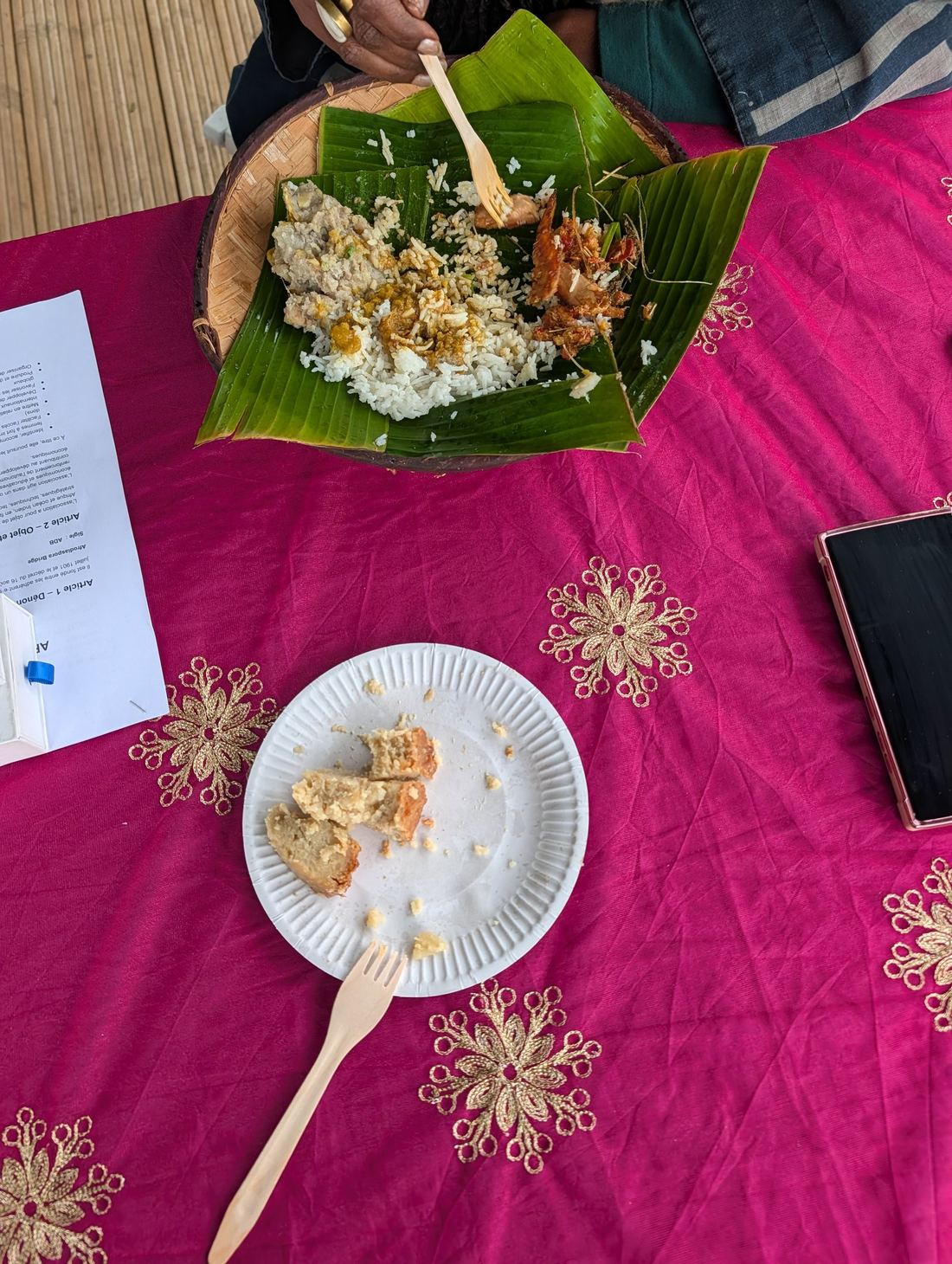
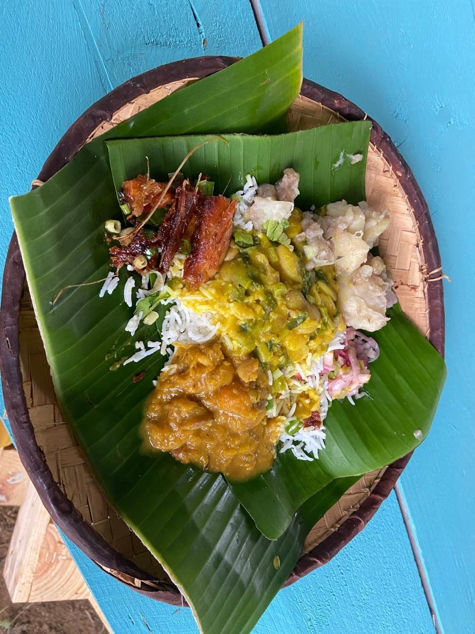
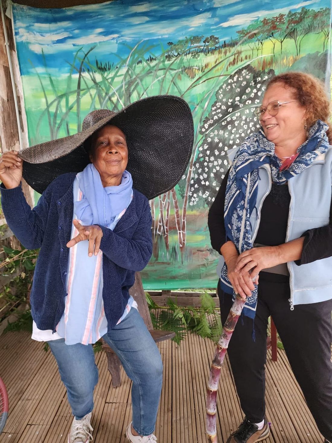
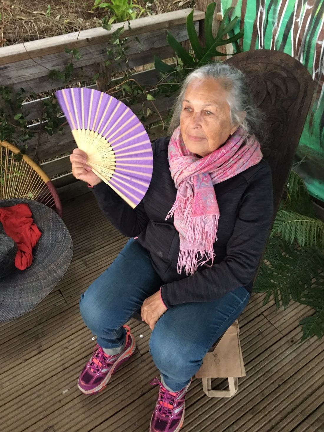
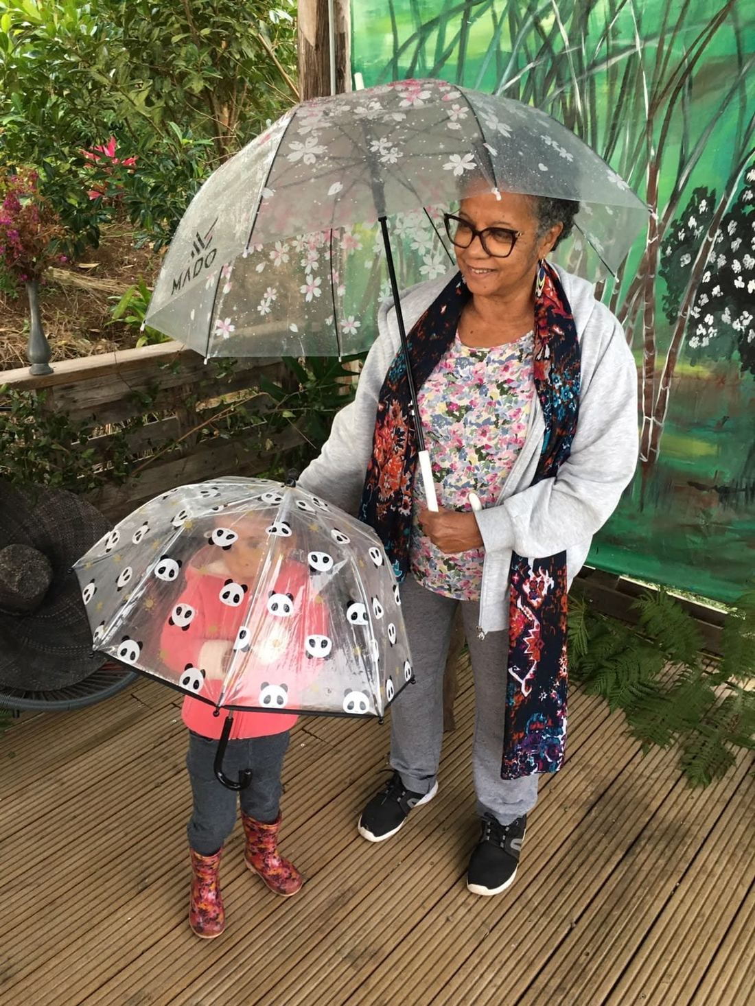
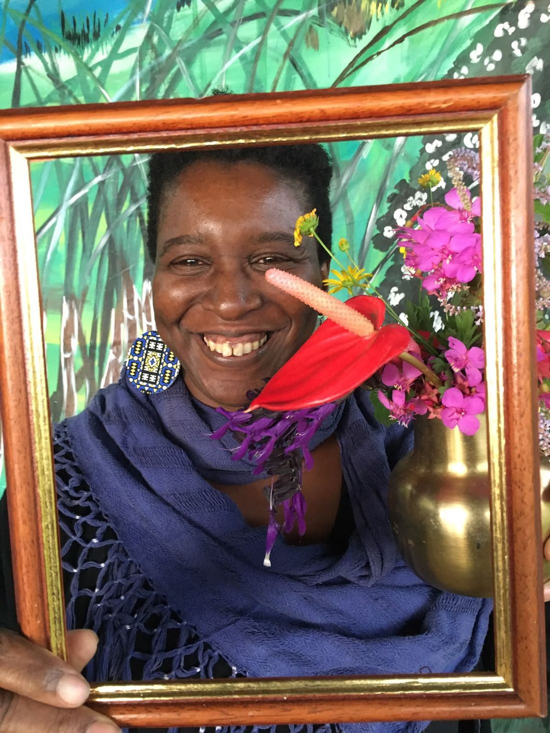
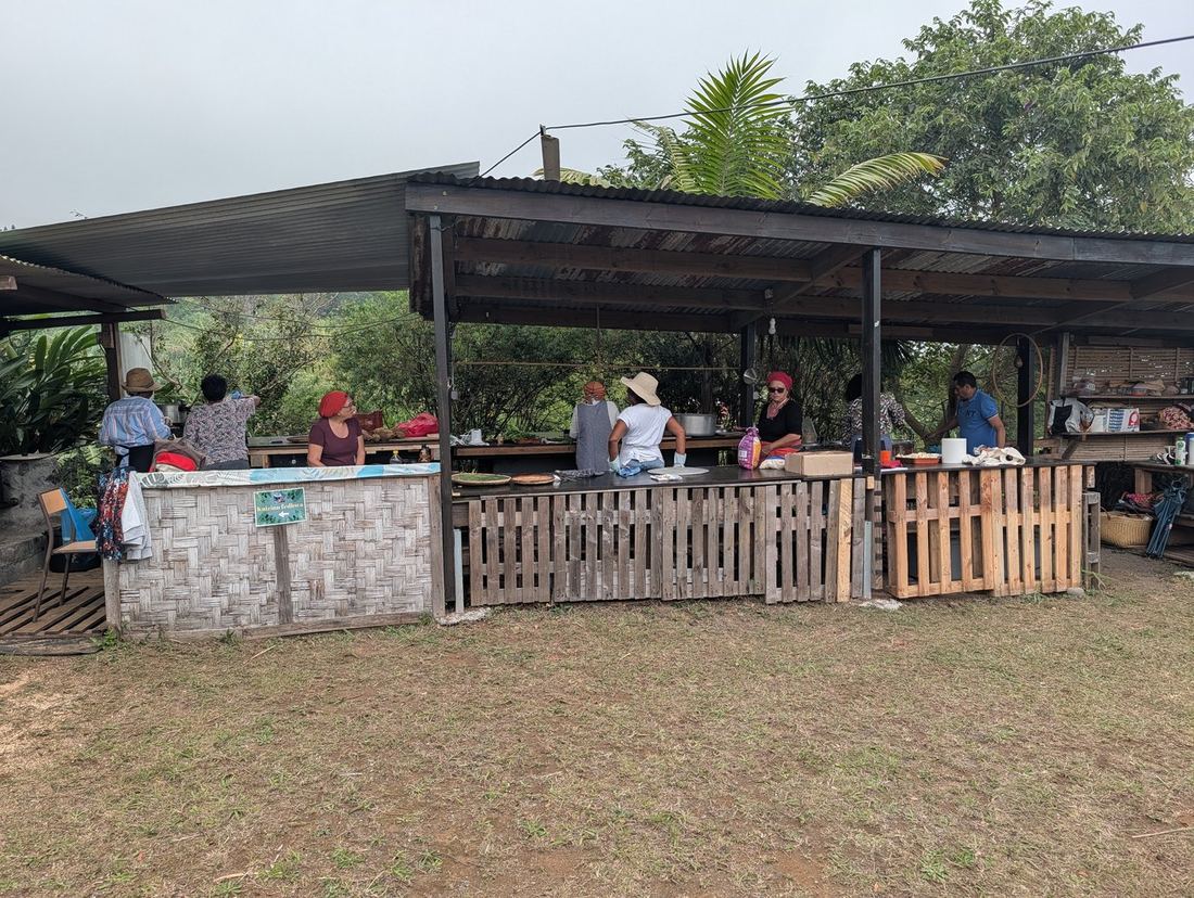
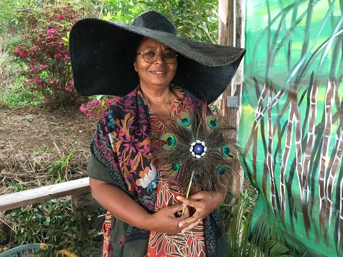
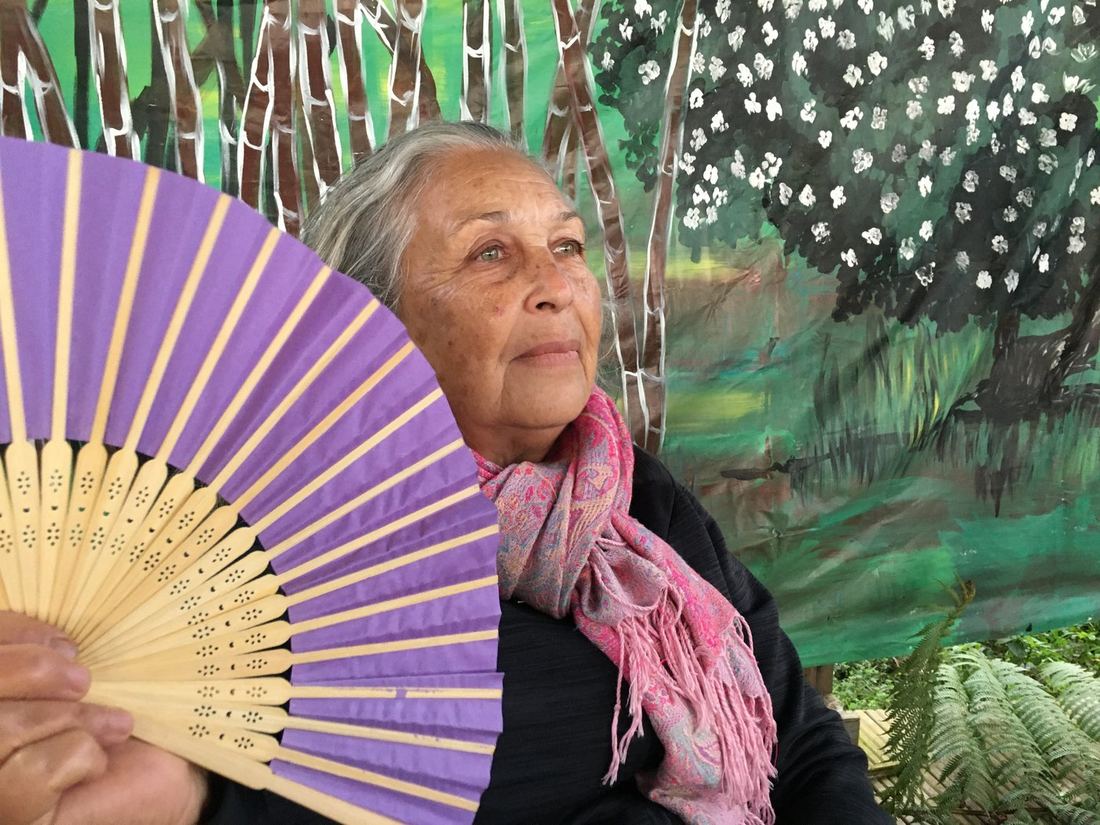
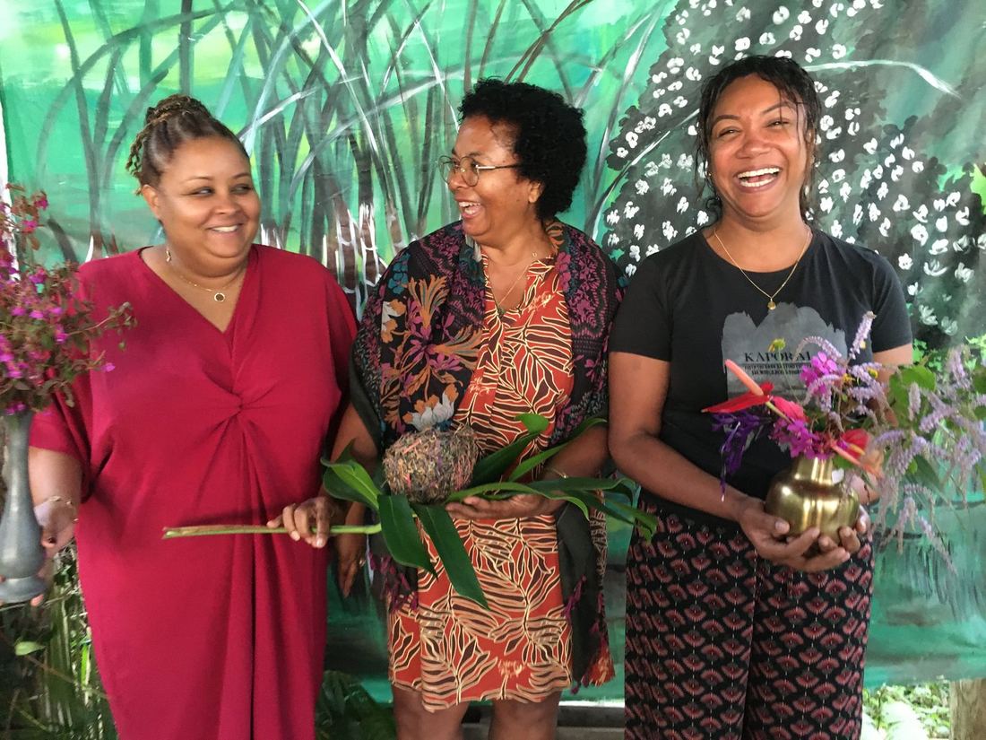
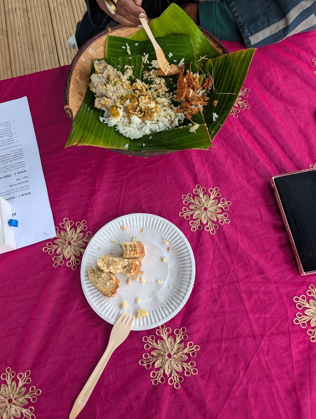
The energy was described as powerful, sisterly, joyful, moving: women spending the day together, cooking for each other, tasting each other's dishes, trading stories about their businesses, their passions, their history. A space that turned out to be rare, and necessary.
Ravenn built the visual system that carries that energy — the logo, the identity, and every piece of collateral that made the first edition feel like a fully-realised brand from day one.
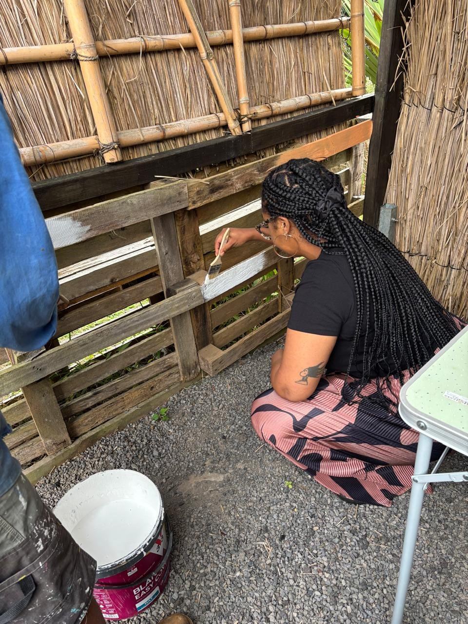
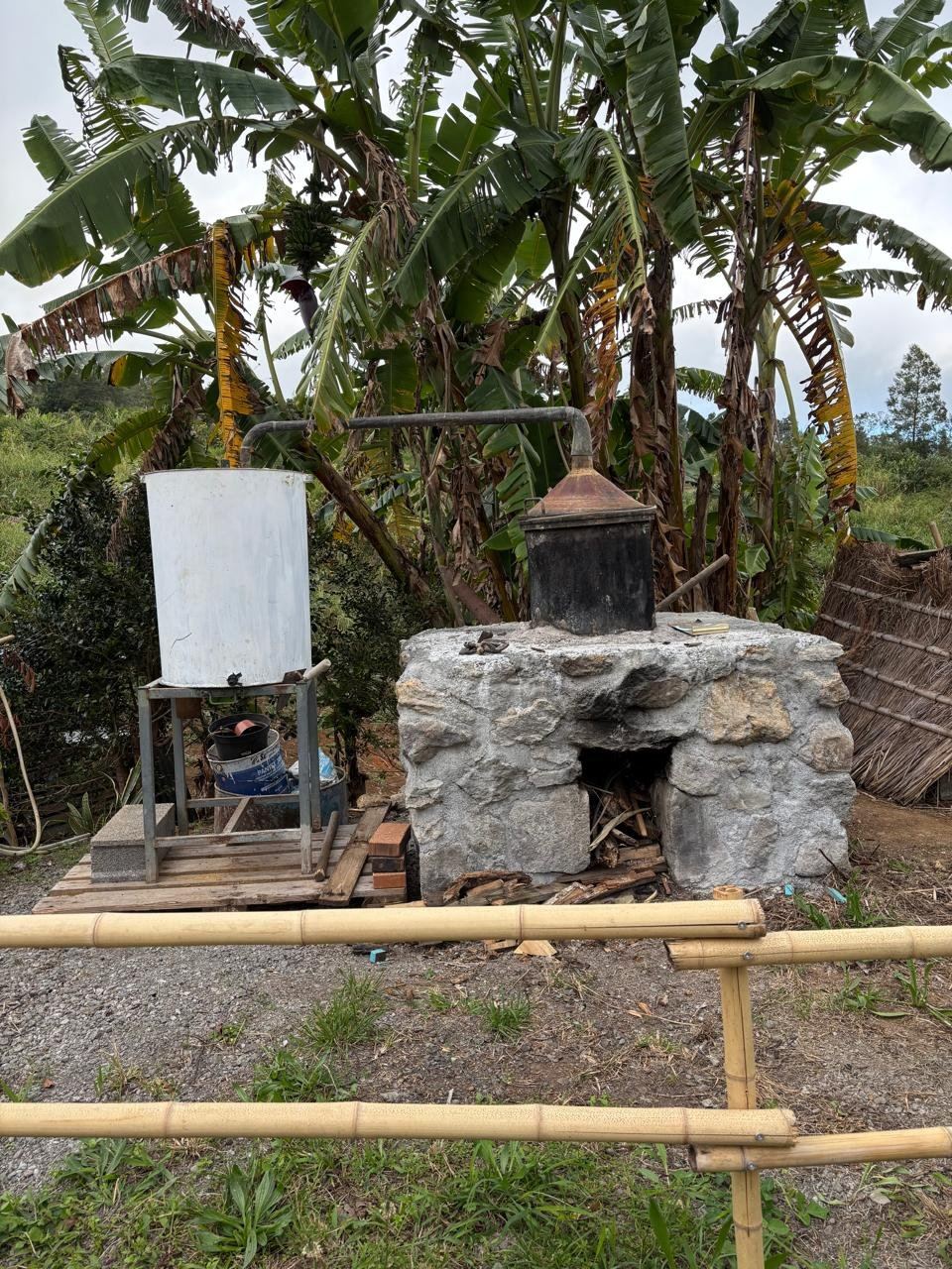
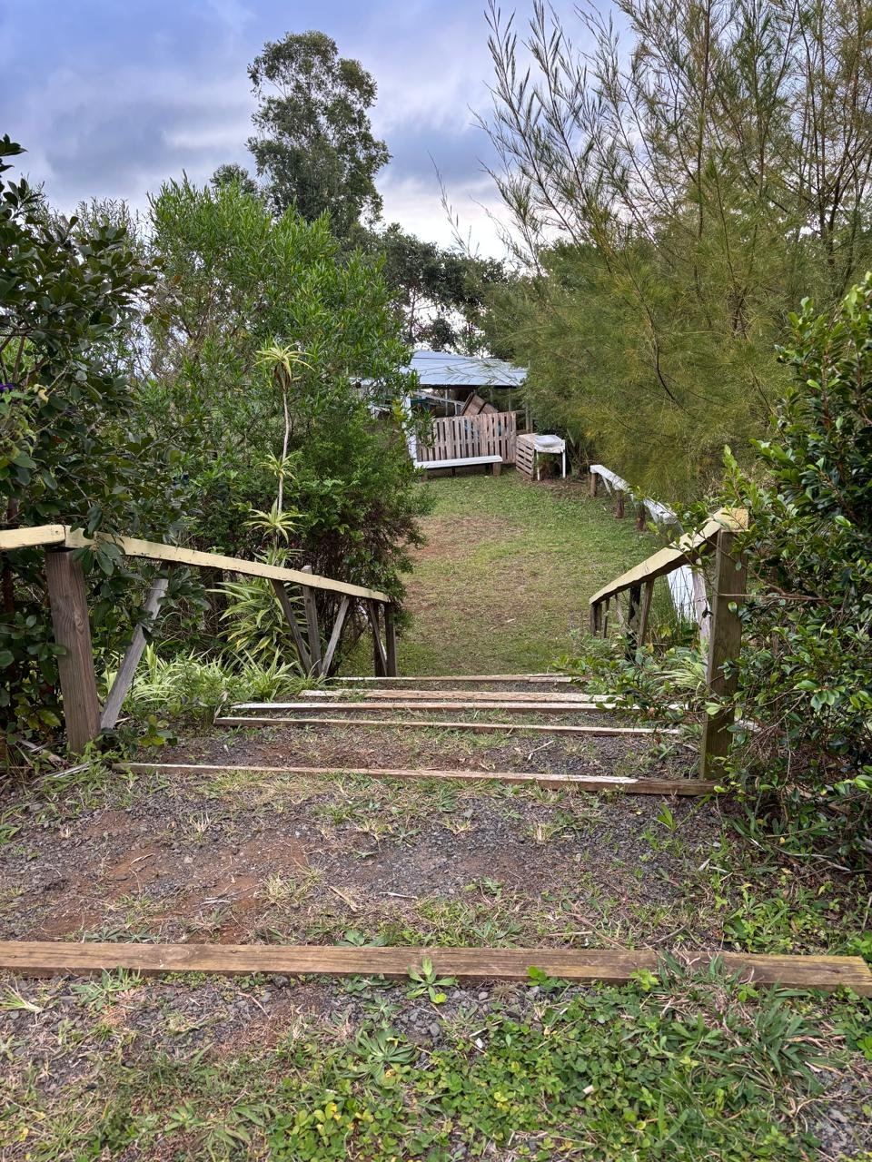
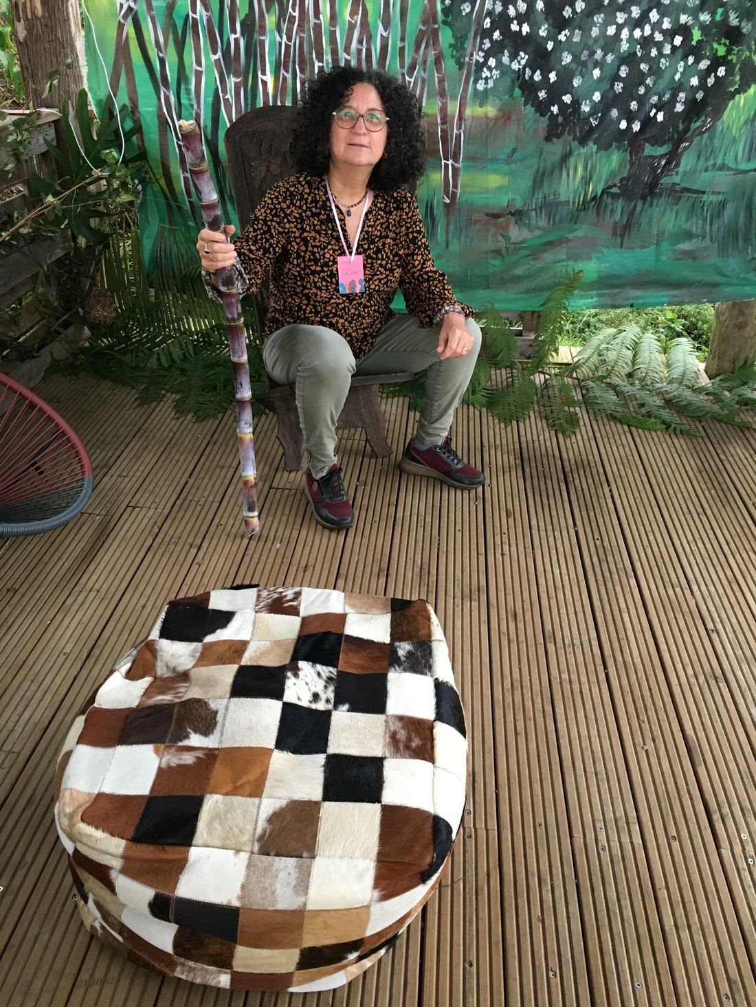
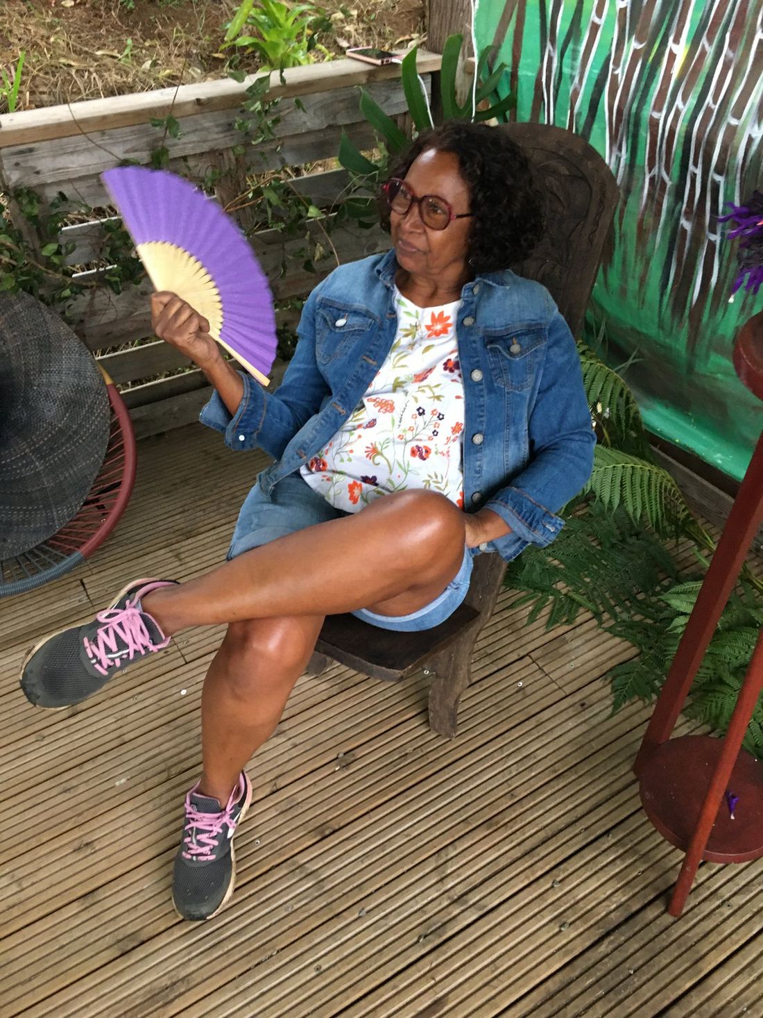
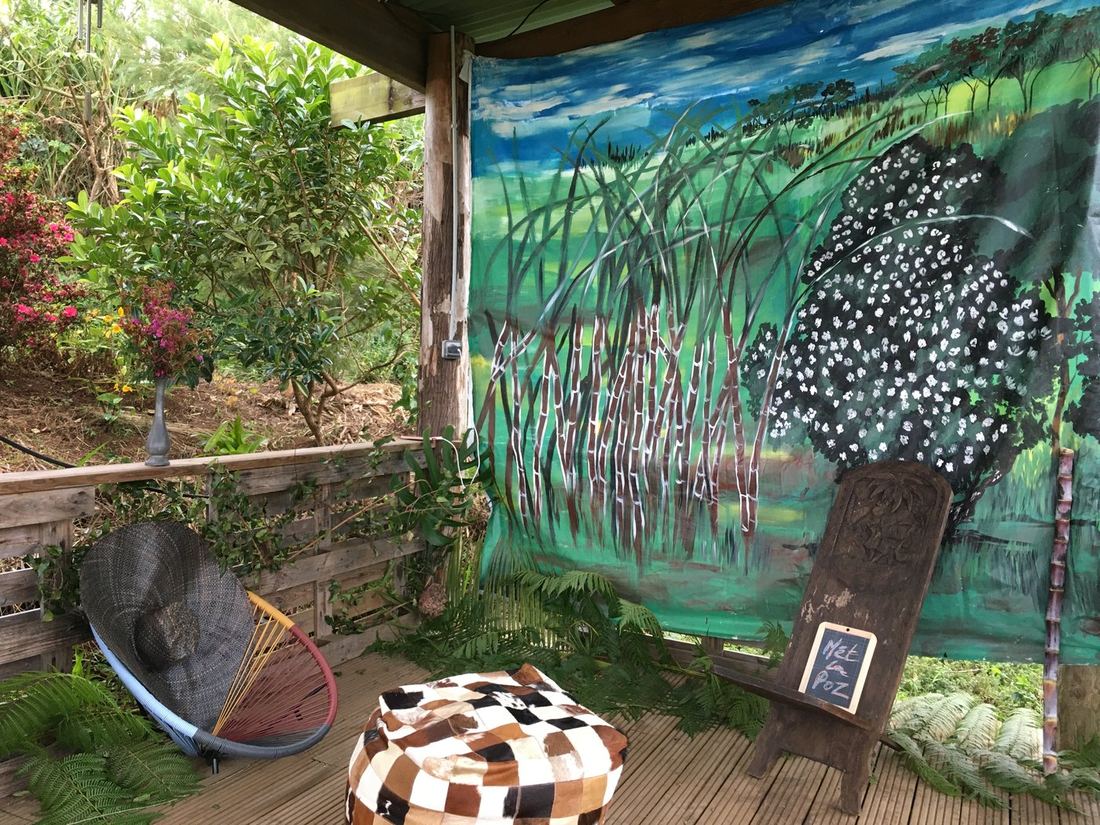
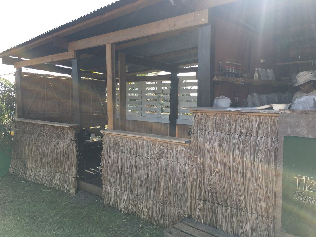
← Scroll to see all the photos — click any one to zoom →
The breakdown
Logo, palette, typography
The complete identity — the NM wave logo, the Power / Sisterhood / Pride palette, and Poppins typography — built to feel bold, human, and unmistakably itself.
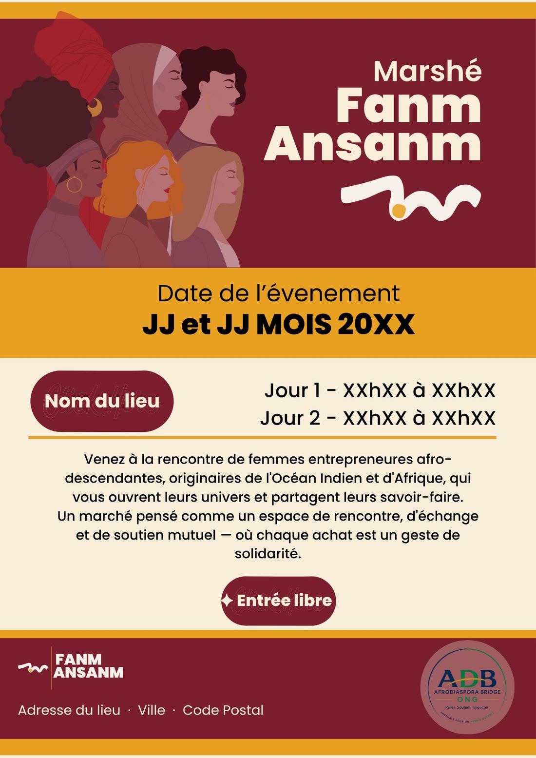
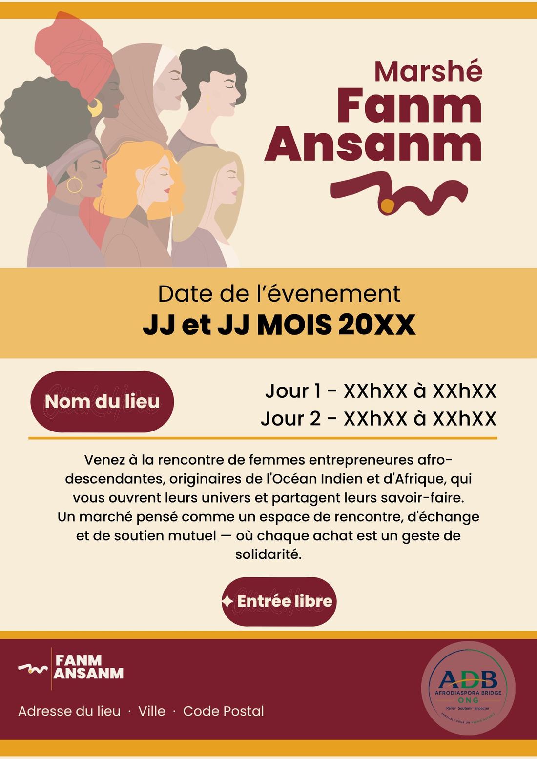
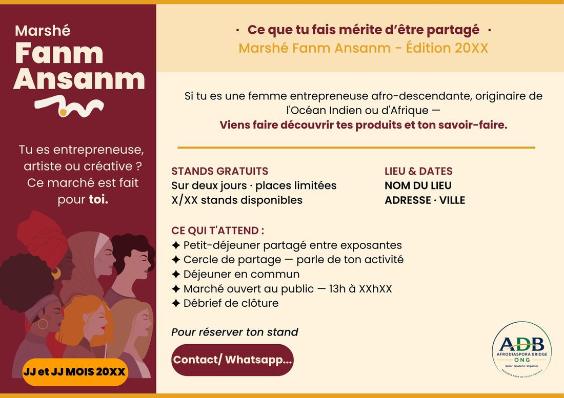
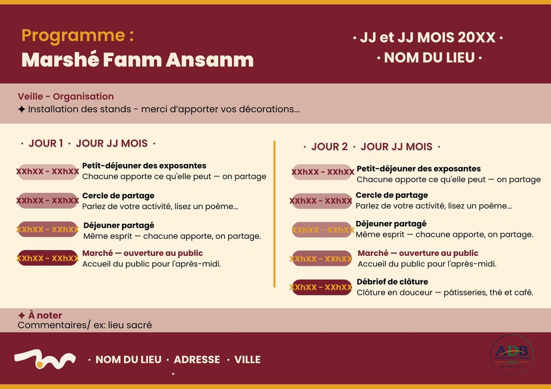
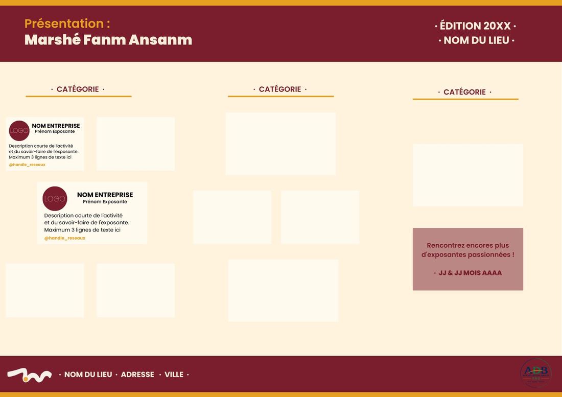
Flyers, programme, signage, banners
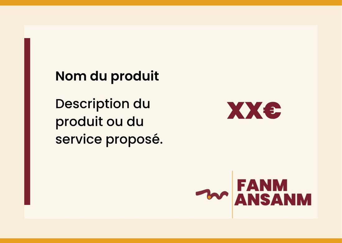
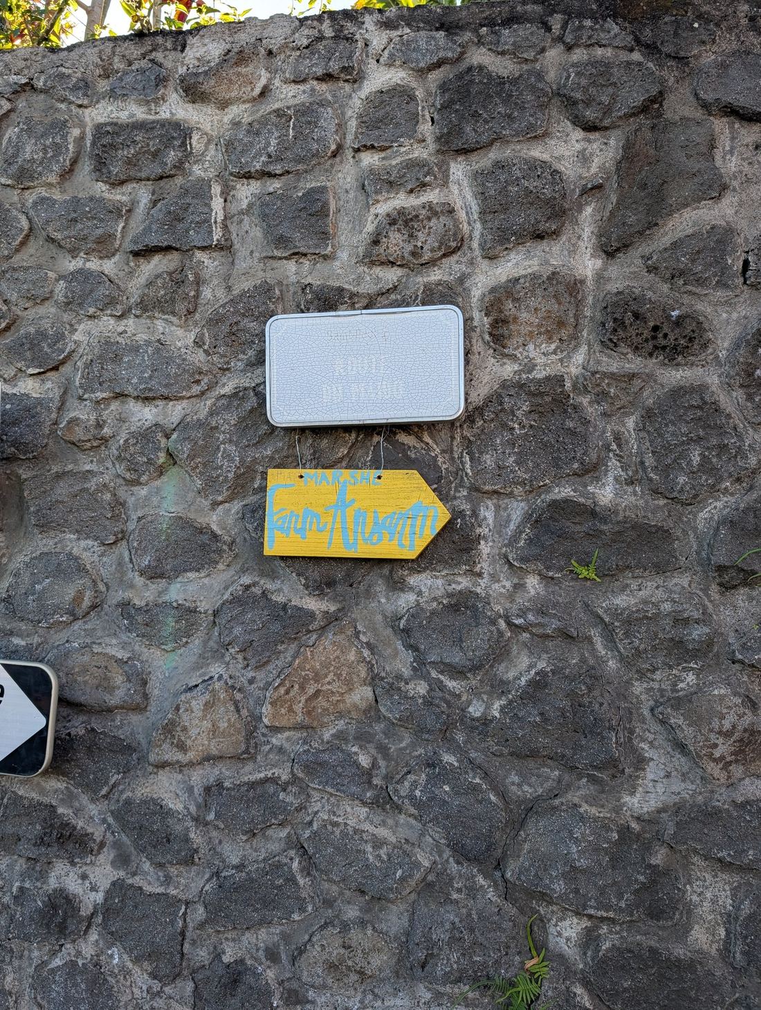
Everything needed to run a market in person — visitor and exhibitor flyers, the two-day programme, price cards, exhibitor directory templates, street signage, and a roll-up banner.
Designed & built for launch
A single-page site introducing the association ahead of its first edition — built to carry the same energy as the market itself.
Hover each card to discover more. ✦
The vision
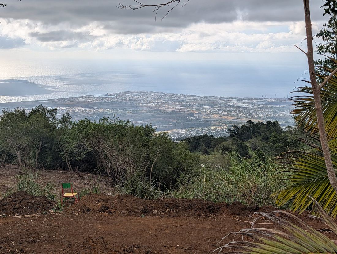
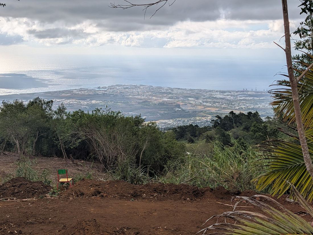
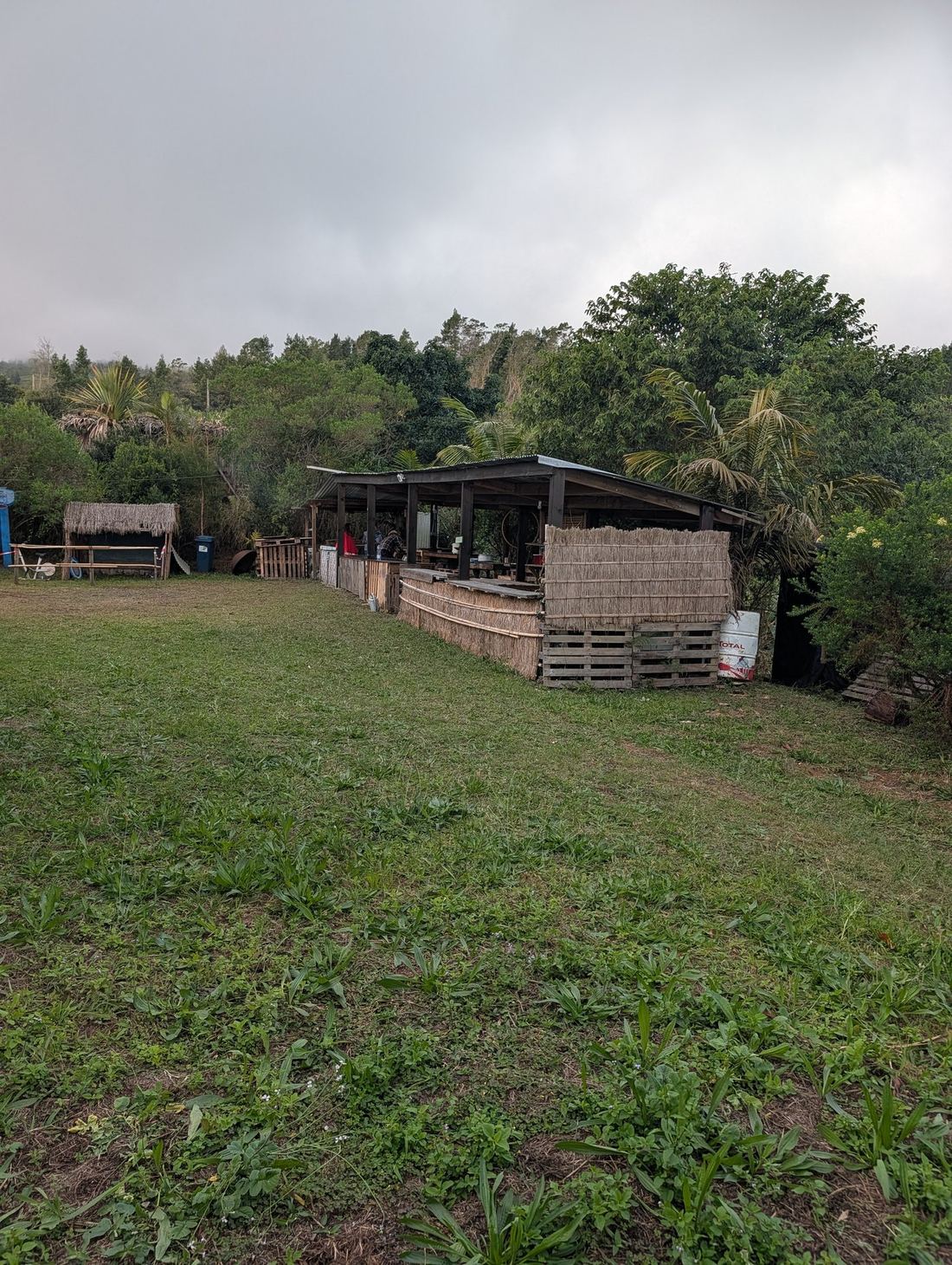
Fanm Ansanm isn't tied to one place. The vision is itinerant — a market that travels across the islands of the Indian Ocean, carrying the same energy from one island to the next.
Where Fanm Ansanm began.
The next stop on the journey.
A community of women waiting.
The wave keeps moving. The diaspora, united.
Parent organization
ADB — Afrodiaspora Bridge — is an NGO co-founded by Klara and Sylvette Annibal, whose mission is to mobilize African diaspora resources to invest in high-impact socio-economic projects. Fanm Ansanm is its community arm, centred on women entrepreneurs and creatives.
Discover ADBInterested in similar work?
From logo to full brand system — reach out if you're building something that needs to feel powerful, human, and unmistakably itself.