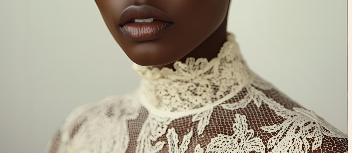
Close, candlelit study of lace against skin
Editorial Brand — Identity & Voice

Presquenue.

A journal on the art, history, and sensuality of what lies beneath.

"Sultry, witty, and a little bit mean."

4
Essays published
1
Brand built from scratch
Stories still untold

✦ Scope of Work

Voice, not just visuals.

Presquenue lives where sensuality meets intellect — a world of corsets, burlesque costuming, lingerie and cultural storytelling. It's a brand, a study, and a statement.

The brief: build a complete identity from the ground up — logo, palette, typography, and an editorial voice sharp enough to carry a journal on the art, history and politics of what lies beneath.

Brand identity · Logo & symbol design · Colour palette & typography · Editorial voice & tone · Content pillars · Journal essays · About page copy

1
Full brand identity
4
Founding essays written
1
Editorial voice system

Brand identity

Softness,
with an edge.

Colour palette
Forest green
Moss green
Muted gold
Ivory
Soft black
Typography
Presquenue
Elegant, editorial, a little secretive
Playfair Display · Montserrat
Creative direction

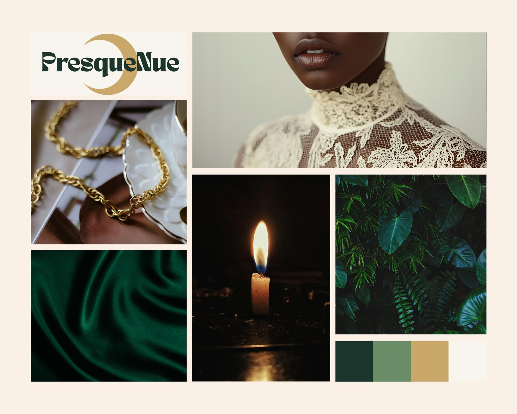
The visual identity lives in dark botanical luxury — where green silk meets golden light. Playfair Display carries the wordmark's poetry; Montserrat keeps the body text clean and modern. Candlelight, chiaroscuro photography and botanical shadows do the rest.

Materials designed
Presquenue full logo with crescent moon
Logo
Presquenue wordmark
Wordmark
PN monogram inside a crescent moon
Monogram
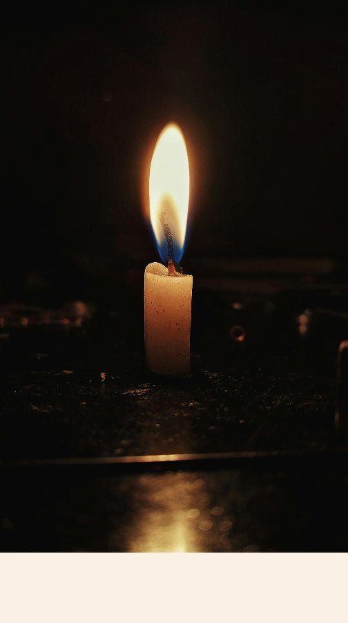
A single candle in the dark — mood reference
Mood — Candlelight
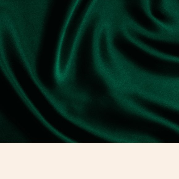
Green silk fabric — mood reference
Mood — Green silk
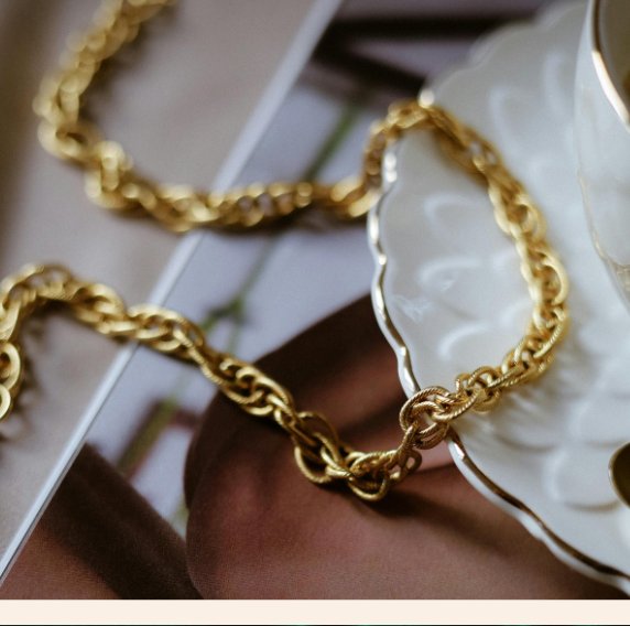
Gold chain jewellery — mood reference
Mood — Adornment
Dark botanical leaves — mood reference
Mood — Botanical
Full Presquenue mood board
Full mood board

← Scroll to see all materials →


The PN monogram inside a crescent moon
The crescent moon

The mark pairs a hand-carved PN monogram with a crescent moon — half revealed, half hidden. It's the pause before revelation: the elegance in exposure, the exact energy of what lies beneath.

P
First letter of Presque
The crescent — a pause before revelation
N
First letter of Nue

The journal

Where lingerie
becomes language.

Presquenue began as a simple obsession: the craftsmanship, the intimacy, the quiet confidence that comes from wearing something beautiful for yourself. It isn't a journal about lingerie. It's a journal about what lingerie tells us — about who gets to be desired, celebrated, seen.

On Presquenue, the corset becomes a lesson in architecture and control. The slip becomes a quiet weapon. And the history of burlesque, so often told without its Black originators, gets its voices back — Josephine Baker's, Baby Esther's, Jean Idelle's.

Ravenn built the complete identity for Presquenue — the logo and crescent-moon mark, the forest green and gold palette, the typography, and the editorial voice that carries through every essay: sensual, well-read, a little mean.

Presquenue is sultry, witty, a little bit mean. She wears green silk, candlelight, and gold chains. She studies what's hidden, and she celebrates what's revealed. Welcome to the art of what lies beneath.
Selected essays

Manifesto

The Art of What Lies Beneath

The founding essay — on falling in love with lingerie as craft, and building a brand around everyone's right to feel seen.

History

The Brown Sugar Beneath the Spotlight

On Black women and the hidden history of burlesque — Josephine Baker, Baby Esther, and the voices pop culture erased.

Soft Armour — Study I

The Slip

On the slip as quiet weapon — modesty and seduction wearing the same fragile fabric.

Soft Armour — Study II

The Corset

On the corset as architecture — structure, control, and the art of taking up space.

Close, candlelit study of lace against skin
Green silk fabric, draped
Gold chain jewellery on porcelain
A single candle burning in the dark
Dark tropical foliage

← Scroll to see all imagery →


The breakdown

Three kinds of work,
one quiet obsession.

01
Brand system

Brand & Logo

Logo, palette, typography

The complete identity — the PN crescent-moon mark, the forest green and gold palette, and a serif/sans pairing built to feel intimate, editorial, and a little secretive.

02
Voice & direction

Editorial Voice

Tone, pillars, manifesto

The brand's voice and its five content pillars — Art & History, Adornment & Style, Opinion & Culture, Craft & Creation, Reflection & Philosophy — plus the manifesto that anchors every essay.

03
Digital

The Journal

Substack essays & About page

Four founding essays and the About page, written and directed to sound like Presquenue from the very first line.

Hover each card to discover more. ✦


The strategy

Five ways to open
the conversation.

Presquenue isn't just a brand — it's an aesthetic education. Every essay falls under one of five pillars.

Art & History

Contextual storytelling

Adornment & Style

Embodiment & visual inspiration

Opinion & Culture

Critical voice

Craft & Creation

Studio & process

Reflection & Philosophy

Intimacy & self-expression


Read it at
presquenue.substack.com Live now

Building voices as strong as the visuals.

From logo to full editorial direction — reach out if your brand needs a voice as considered as its visuals.